Things to Know When Taking AP Art and Design (Guide 5)
12 min read•june 18, 2024
S
Sherry Ross
AP Art & Design 🎨
18 resourcesSee Units
What’s the Difference Between Plagiarism and Appropriation?
This is a tricky concept for people to grasp. As a rule of thumb, a found source image (one you found on the web instead of taking yourself) must be at least 65% changed to be considered an appropriation rather than plagiarism. Artistically, appropriation simply means to take a source image that is not your own and change it SIGNIFICANTLY to suit your own personal vision. Plagiarism means to directly copy something from someone or somewhere else.
Here's an Analogy That Might Help 🤔
For this analogy, let's say you borrow a sweater from a sibling without their permission – that would be plagiarism. You make no changes to it, it is still the same sweater. It might look different on you, people might even think it’s yours, but it’s still your sibling’s sweater, unchanged. Now, suppose you take that same sweater, cut off the arms, and splash paint all over it. Now, it’s YOUR sweater – you’ve changed it from what was their sweater to something new you made. That’s appropriation. I don’t recommend doing this with a sibling’s sweater, but for working with a found source image, it’s GREAT! 🤩 🙌🏽
Well, How About a Visual Example? 🙋🏽♀️
Sure! This is the Mona Lisa by Leonardo Da Vinci, arguably one of the most famous artworks in the world. It is instantly recognizable. It has been reproduced, written about, studied, and admired all around the world. It is one of the world's most valuable paintings, and nearly six million people a year visit her in the Louvre Museum in Paris.
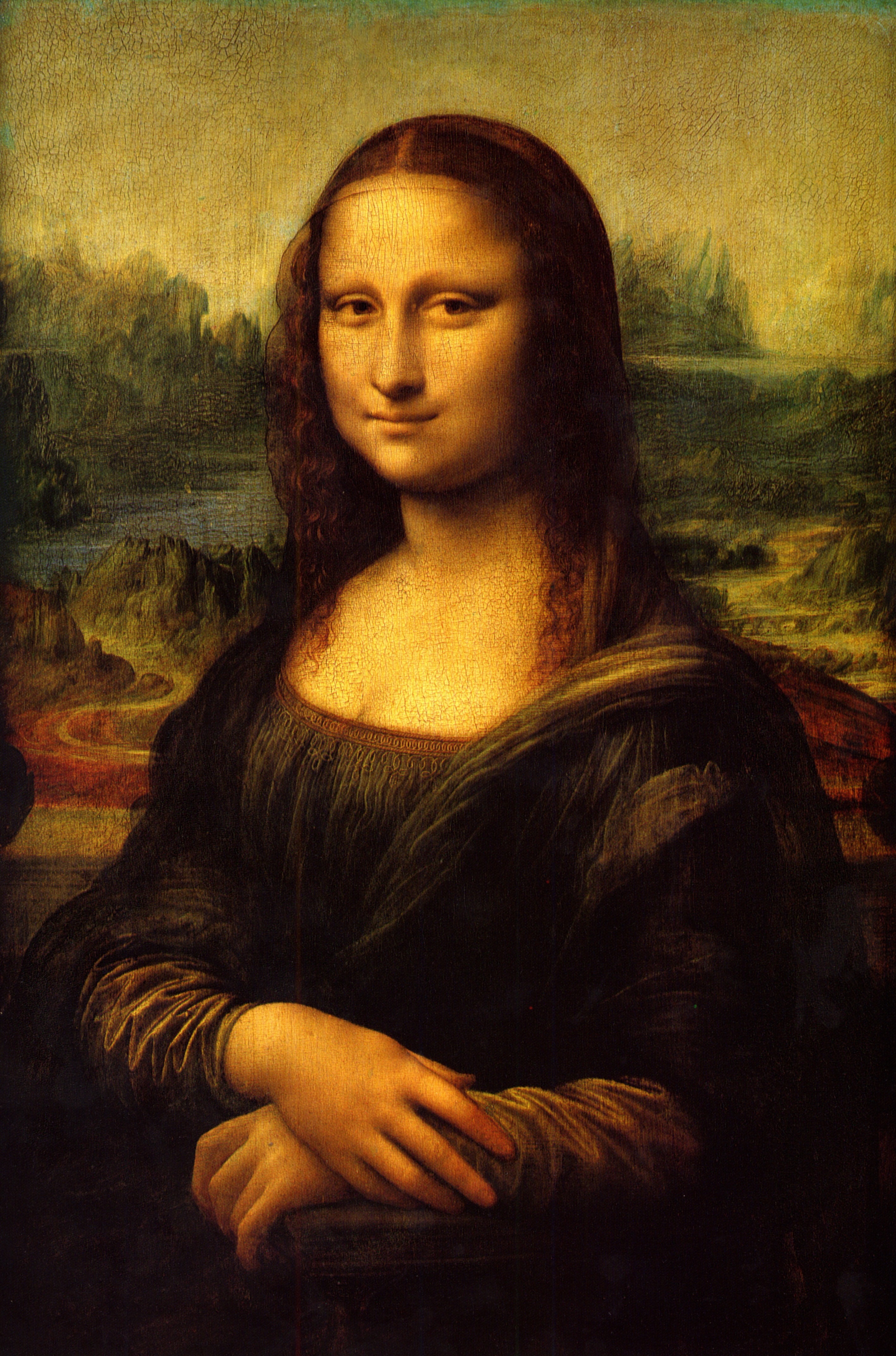
Mona Lisa (La Gioconda), Leonardo Da Vinci, 1503 - 1517
This is “L.H.O.O.Q” by Marcel Duchamp. While there is a minor physical change to the work, there is a huge conceptual impact, which forever changes the work for the viewer.
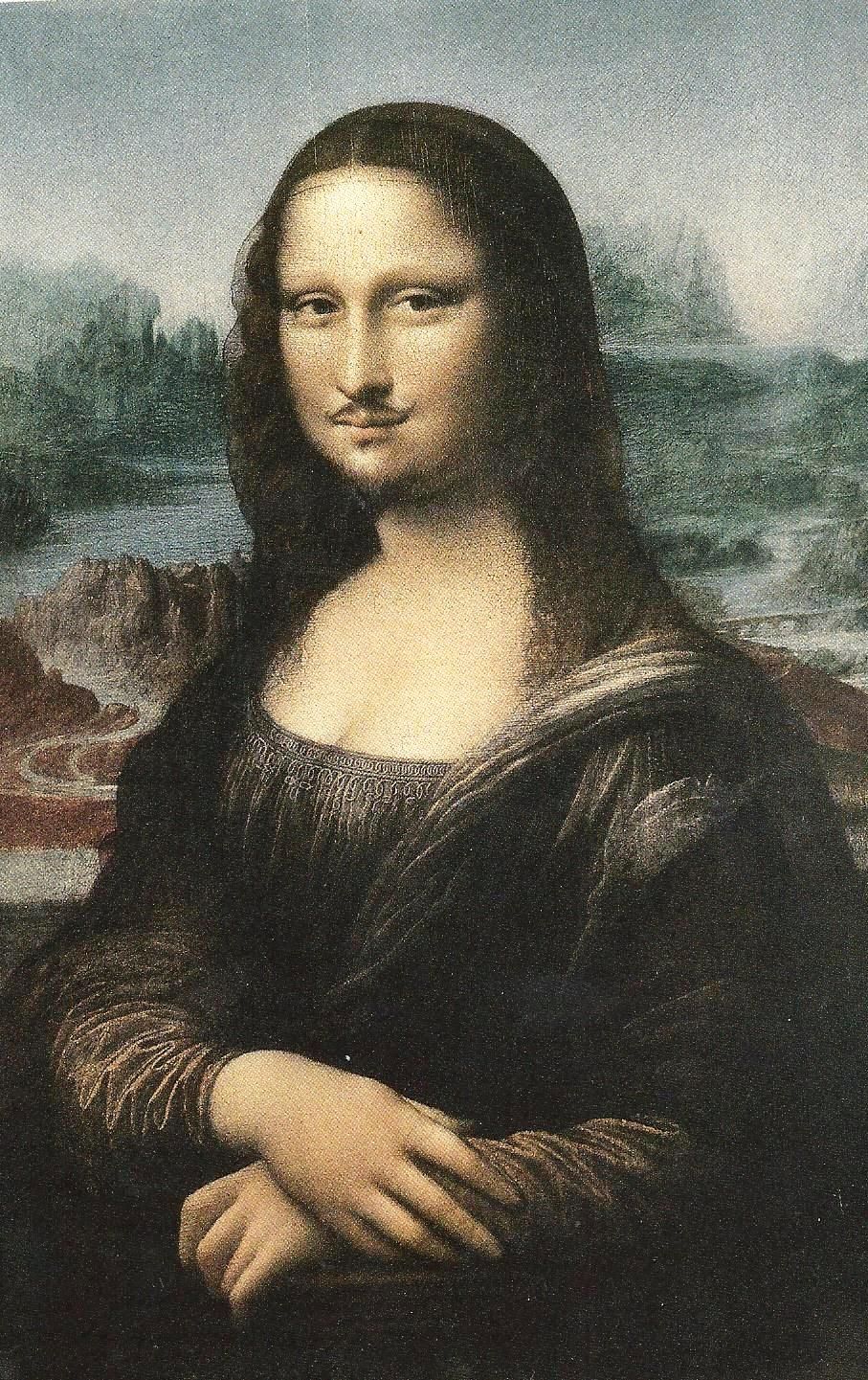
L.H.O.O.Q,
Marchel Duchamp, 1919
“But how?” you might ask “That’s just a tiny mustache and goatee!” You have to understand a few things. The title spells out “Elle a chaud au cul” which translates into “She has a hot a**”. He took the most famous painting in the world, and created a piece mocking how revered it was, and therefore, took on the idea that art is precious. He forever changed how one views the Mona Lisa because once you see his, you will think of it when viewing the original. He’s kind of a character Google his work, you'll be glad you did. 😍 🤣 🤓 (art nerd alert)
Here’s another example:
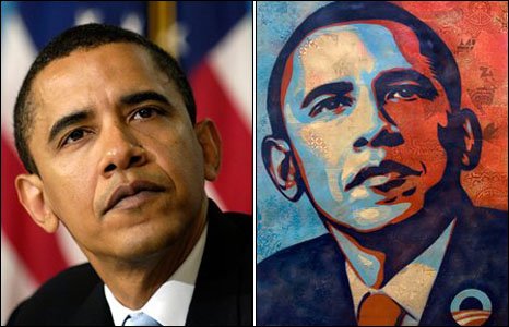
Fairey used the photo he got doing a google image search and created the image on the right. He thought that he changed it enough to count as appropriation. Since he used a credited image without permission, he was sued and had to pay a substantial fine. 😢 💲 Only use royalty-free images (images within the public domain available for use by everyone- they will be marked) as sources for your work. If you can, take your own original source images to work from.
How Can I Properly Use a Source Image?

This is a famous image of Tupac Shakur from Getty Images. They own it. If you want to use it for your work, it costs $175. I am properly crediting it for this example to show you that internet images ARE NOT FREE.
I’ve seen various unauthorized copies of this photo, hundreds of times over the years. If you want to do a drawing or a painting to practice your skills or because you love his music, great! 👍🏽Hang it on your wall or give it to a friend. However, it’s not appropriate to submit as an original work of art for the AP® portfolio. 👎🏽
If you take the same photo and think, how can I change this image? For some reason, I thought about putting a Captain Crunch hat on his head to cover his bandana. Then I thought about how else I could change the images I was working with. I wanted the Captain to represent a person of color (POC), so I changed the skin tone and the text tone.
I added Tupac to the slogan because I thought of how many students I’ve had that would love to be “Tupac-a-tized” and instantly have his talent. Then, I added a filter to further change the image. I’m not saying it’s great art, but it is showing a significant change to source images I did not own. It also presents a different reality showing a prominent advertising spokesperson as a POC, which is a powerful message.

Not only did I change the images, but I also showed a purposeful intent to change the messaging sent with it. That is the IDEATION (the idea or thought) behind this piece. For a stand-alone piece, there is probably not enough change in the image. However, if I was using this as part of a larger inquiry exploring “How can a person of color be included in product branding to reach a more diverse market?” or “Would using a person of color as a product spokesperson change perception?” it might work within the larger exploration.
So, when you want to use an image as a source that you didn’t photograph yourself, make sure you are altering the image into a new and DIFFERENT work. AP used to call this changing the “image in the service of a larger personal vision”. You might find this idea useful as we talk about Sustained Investigation (SI) and deal with inquiry in another guide.
How Do I Photograph My Work for AP Digital Submission?
How Can I Photograph My Work?
You don't need a fancy camera to photograph your work well. You can use any digital camera or phone that can take a clear photo. It's really easy once you get the hang of it. Plus, taking them with your phone makes it that much easier for you to drop them onto your social media accounts and wait for the ooooohs and ahhhhhs!
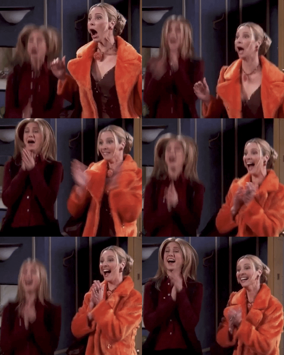
Does it matter if my work is 2D, 3D, or drawn?
YES! When you are dealing with work that is primarily 2D (flat) you need to photograph it straight on. That sounds kinda strange to say, but most people put their work down and photo it. That leads to a distorted photo. This is what that looks like.

That is NOT what you want! There are two easy ways to get the correct straight on photo that you want.
- You can tape or pin up the piece on the wall in front of you and aim. Make sure you hide the tape on the back or, if you put it in the corners, CROP IT OUT! Do not stand between your work and the light source. Try your flash if you find this hard to do.
- You can place the piece on the floor and lean over it, centering the work in the middle of the viewfinder or screen and take the photo. Be careful - depending on where your light sources are, you can easily cast shadows on your work. Move yourself, the work, or the light source so that you can get a good photo.
Take multiple pictures, trying to center it, or even fill your image area with the work. If you can photograph it that way, it means less cropping later. Turn the image to best fit the viewfinder (camera) or screen (phone). You can rotate it later..... but it makes it easier for you to shoot.
Take multiple pictures, trying to center it, or even fill your image area with the work. If you can photograph it that way, it means less cropping later. Turn the image to best fit the viewfinder (camera) or screen (phone). You can rotate it later..... but it makes it easier for you to shoot.
If you are new to photographing artwork, try taking some with and without the flash. You don't want to flash out your color, but you also don't want shadows. Some people like to take their photos outside on an overcast day to reduce shadows.
You want your photo to turn out like this (but with finished artwork, not just something random you can reach for an example 😉).
Do I need fancy lights and stuff?
No. Lots of people shoot outside. That can get hot, so if you prefer, do it indoors. For 2D, follow the above guidelines about lighting—inside or outside. For 3D, things get more complicated. When you are shooting 3D work you need to consider the following:
- Background—You want a neutral background that "fades" out of the viewer's awareness. It should be ALL ABOUT THE ART, not what it's sitting on or in front of. If the piece is small, try using a large piece of paper, taping it behind the work, and bending it forward so that the artwork has a seamless background. If the work is larger, try using a solid color sheet, again making sure it extends under the piece and in front of it. White works well for almost anything. If the piece is white, consider using another solid color.
- Shadows—When you are dealing with documenting (photographing) 3D work, you need to think about how it interacts with the space AROUND it. Are there interior empty spaces? Are there extensions you need to consider? The shadows created not only inform the viewer about the work, but they also contribute to the work by depicting the space it inhabits. Try moving your lighting source around the piece while photographing. Sometimes, it's easier to have someone else hold the light while you photograph.
- Form—Since this is a form (meaning it occupies 3D space) rather than a shape (confined to 2D or flat space), your photographs need to document the form of the work. Move around the work, changing perspectives, and viewpoints to capture all angles. You might want to move the lighting as you do this.
- Lighting—For your lighting, you have several options. While regular room lighting might show the work, it won't give you strong shadows. You can try shooting outside and let strong sunlight do it for you, but you have to watch for your own shadow. For controllable directional lighting, you can use the flash on your camera or phone, a flashlight, or any small movable lighting source. A small desk lamp is usually really good for this, especially if you can remove the shade. As you light the work, move the light into different positions - high, low, left, right - and look to see what creates the most interesting lighting on your work and the best shadows.
💡 Pro Tip: 3D work is ALL ABOUT SHOWING FORM AND SHADOW!
- Multiple views—As you photograph, make sure to MOVE AROUND THE WORK, changing perspective and viewpoint. For 3D work, you will need at least two photos of each work showing significantly different views to help the readers understand how the work interacts in the space. It's perfectly acceptable to move the work to keep the background neutral, especially if you are working in a tight space. 👍🏽 If you have several great shots of one piece, you can always use a composite (multiple photos in one) image.
What About Editing the Photos?
For documenting your artwork, you want the photo to look as NATURAL as possible. Things like cropping, straightening, color correcting, and increasing contrast are all ok. You don't want your photos to look overly "done". Things like filters, color changes, over saturating, and overly HRD'ing it all will distract from the work and shift the focus to the effect, not the work.
When you are preparing your photos for submission, save your work as a JPG. Make sure it is saved in the correct orientation (vertical or horizontal). Save your images as close to 5 MBs as possible. The website says 3 MBs and gives a specific size.... it will take up to 5 MBs. You don't want your images too small to be viewed! 🔍
Name your files so that you will know they are the ones edited and prepared for AP. This will make it easier to find the correct ones. You can use the name of the piece or something as simple as SI1, SI2, etc. The image name isn't shown so don't worry if it "doesn't match" the location you put it in. 😉
Can I Use a Filter on it?
Simple answer? NO. Keep your photos as close to raw as possible. See the above post.
What size does it need to be?
All submissions must be under 5 MBs to be able to be uploaded. Keep the size as close to that as possible.
How should I name it?
Name it something that will designate to you what it is. Use the name of the piece or something like SI1, SI2, etc. This will make it easy to find and it will let you know you have already edited and sized it for upload. 👍🏽
Are There Things I Just Shouldn't Do?
The answer is yes and no. There are some things that just don't work well for a Sustained Investigation by their very nature. There are others that are just so overdone, so might want to avoid them. There are some that are trite and don't have enough "meat on the bone" to successfully explore them. This list will explain some of them. After you check it out, head over to What is an Inquiry (link), and read up on how to select a successful one or beef up your already existing idea.
Keep in mind that this is just a list of suggestions to avoid. You want to make artwork that speaks your truth and tells your story. However, out of all of the times that something overdone is submitted to AP, there can be a shining example that breaks the rule. If you aren't sure it will be you.... try to come up with something you will be amazed with!
- Copyrighted characters—Unless you are Bob Kane, Batman is not your creation. The College Board is hip to this. It's morally wrong to present it as your artwork, it's also illegal. Avoid all copyrighted characters, images, trademarks, logos, etc.
- Anime—You shouldn't use anime replicated from videos, graphic novels, etc. If you create your own characters and develop a storyline, that's a very different thing than "fan art". Here's a great example of an AP Art student that created their own graphic novel. Keep in mind this is a legacy (old test version) example, but it is really well done and speaks greatly to individuality and student voice.
- Trite ideas—These are things like "My Friends", "Music", "Hands", "A day at the beach", "My Family", "Eyes are the Windows of the Soul", etc. They are very simplistic and don't offer much beyond a simple visual representation. If you really want to do portraits of your family, for example, think of how it can become an INQUIRY. A simple idea like "Portraits of my family" be changed to something like "What shared activities bring my family closer together?" which would allow you to show a depth of exploration of the topic.
- The Seven Deadly Sins—This one has been done to death. It's low hanging fruit and it often listed on "AP Idea" lists. Try to avoid these lists, unless you are using it as a starting point to think of another investigation.
- Pretty much ANYTHING on Pinterest or an AP Idea list—See above. These are listed because they have been done soooooooo many times, BY OTHER PEOPLE. If you think you can bring something to it that the previous 57,498 people who did exactly that topic, did... go for it. But, it really is better to find a topic that has some personal relevance to you.
- Internal Relevance—Avoid a topic that is so YOU specific, others can't really access it. While you want your Guiding Question and Inquiry to be personally relevant, it can't exclude everyone else. As much as you might want to do "How do I feel when I listen to my favorite music?" your audience won't have access to the music. They might never have heard, it even if you list it. Depicting these ideas visually is also exceedingly hard.
However, finding an important, personally relevant topic and making it accessible for others can create amazing artwork. It can inform the viewer about an internal conflict they might have no prior experience with, such as this incredible AP submission dealing with the body dysmorphia experienced by a transgendered student.
Browse Study Guides By Unit
🔖Unit 1: Course Overview
🍥Unit 2: Portfolio Design Skills
🤔Unit 3: Portfolio Analysis
💯Unit 4: Exam Rubrics
💡Unit 5: Frequently Asked Questions about AP Art Portfolios
📚Study Tools
👉Subject Guides

Fiveable
Resources
© 2025 Fiveable Inc. All rights reserved.