2.2 Representing Two Categorical Variables
3 min read•june 3, 2020
Peter Cao
AP Statistics 📊
265 resourcesSee Units
There are many ways in which we can represent data from two categorical variables. Some of these are more graphical, like side-by-side bar graphs, segmented bar graphs, and mosaic plots, while others are numerical, like two-way tables (also called contingency tables).
Various Tables and Diagrams
Two-Way Tables
We can represent data using a two-way table, which shows how the individuals are distributed in the cells relative to other variables.
Here is an example of a two-way table:
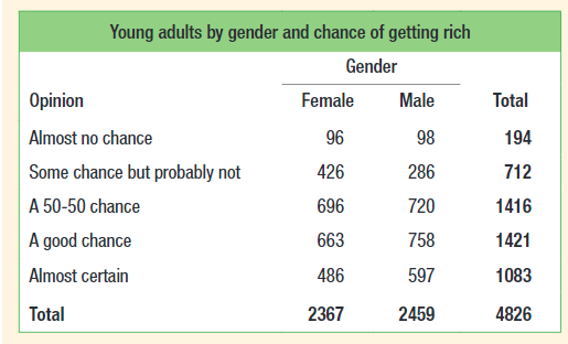
Courtesy of Starnes, Daren S. and Tabor, Josh. The Practice of Statistics—For the AP Exam, 5th Edition. Cengage Publishing.
Here is a survey of 4826 people where the participants were asked about their chance of getting rich. We can see that 194 of the participants felt that they had almost no chance of getting rich and that 2367 of the participants were females. We can also see that 758 males thought that there was a good chance that they could get rich.
Joint Relative Frequencies
We can also put relative frequencies in a two-way table, where the frequencies in the table are a proportion out of the whole survey sample size. A joint relative frequency is one that has the proportion that an individual surveyed shares two characteristics, for example, being female and almost certain. The joint relative frequency for this is 486/4826 as there are 486 males who are almost certain and 4826 total people were sampled. In a joint relative frequency two-way table, the overall total in the bottom right will always be 1.00.
Side-by-Side Bar Graphs
We can put this in a side-by-side bar graph where we have the joint relative frequencies for one value of one of the categorical values put side-to-side to another.
Here is an example of a side-to-side bar graph:
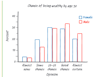
Courtesy of Starnes, Daren S. and Tabor, Josh. The Practice of Statistics—For the AP Exam, 5th Edition. Cengage Publishing.
Here, we have the dividing category being gender and each of the bars is the percentage of each gender who have a certain opinion.
Segmented Bar Graphs
Segmented bar plots are another way to visualize this data. Here, the bars of each gender are stacked like this:
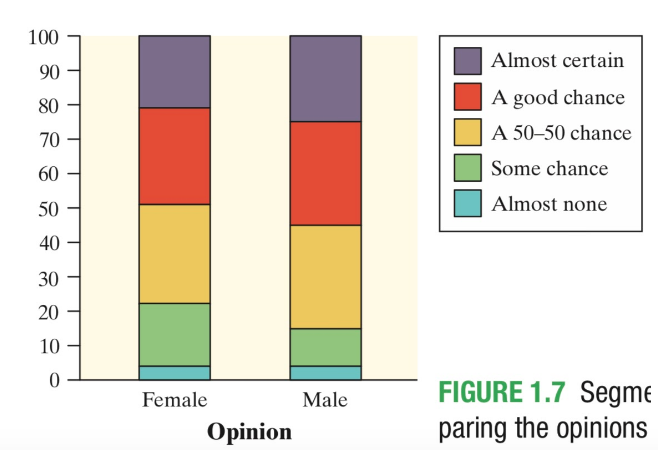
Courtesy of Starnes, Daren S. and Tabor, Josh. The Practice of Statistics—For the AP Exam, 5th Edition. Cengage Publishing.
Here, we can see that the cumulative frequency for each gender is 100%. This allows us to compare the size of the different responses given by one category.
Mosaic Plots
Mosaic plots are similar to segmented bar graphs, except with a twist. Here, the widths of the bars are also different, and is proportional to the number of people answering in each primary category. The areas of each of the regions relative to the whole plot are the joint relative frequencies. A mosaic plot is a graphic version of a two-way table. Here is an example of a mosaic plot:
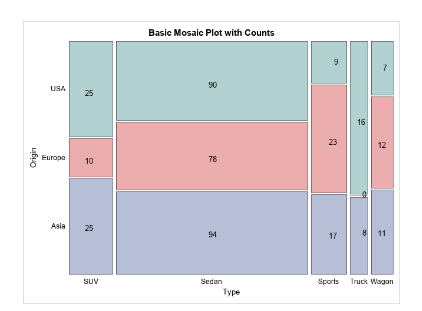
image courtesy of: blogs.sas.com
Determining Associations from Graphical Representations
In each of these, we can show if these categorical variables are associated or not. If they are associated, then we can say that they are also correlated or dependent. To do this, compare the heights (or widths) of the corresponding segments across different categories, of the heights are significantly different, then we can say that they are dependent, as this means that a certain group in one category may be more likely to have a certain response in another category but it doesn’t mean that there is a cause and effect relationship between the two.
Remember, correlation does not equal causation.
🎥Watch: AP Stats - Exploring Two Variable Data
Browse Study Guides By Unit
👆Unit 1 – Exploring One-Variable Data
✌️Unit 2 – Exploring Two-Variable Data
🔎Unit 3 – Collecting Data
🎲Unit 4 – Probability, Random Variables, & Probability Distributions
📊Unit 5 – Sampling Distributions
⚖️Unit 6 – Proportions
😼Unit 7 – Means
✳️Unit 8 – Chi-Squares
📈Unit 9 – Slopes
✏️Frequently Asked Questions
✍️Free Response Questions (FRQs)
📆Big Reviews: Finals & Exam Prep
Fiveable
Resources
© 2023 Fiveable Inc. All rights reserved.