2.2 Principles of Design for AP2D and Draw
3 min read•june 18, 2024
S
Sherry Ross
AP Art & Design 🎨
18 resourcesSee Units
Principles of Design: AP2D + Draw
The principles of design revolve around HOW the elements of design are used within a piece of art to visually represent these ideas. Here are some very simple illustrations depicting these principles.
Opacity/Transparency—The degree to which design objects can be seen through or not. Deals with layering and playing with their interaction.
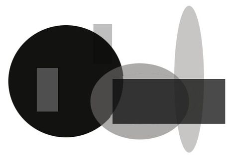
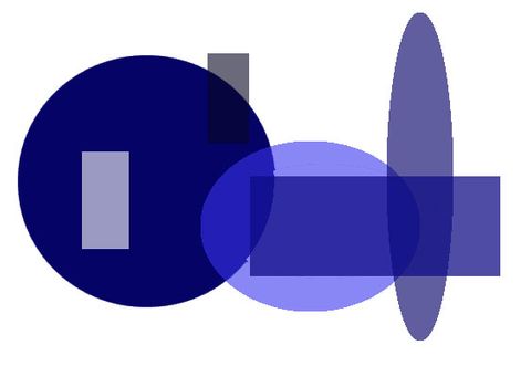
Value/Contrast—Value is the level of lights and darks in a color, like light blue versus dark blue. Contrast is the intensity of that difference.
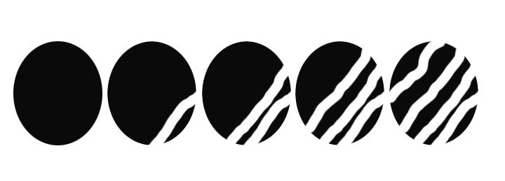
Time—How do the element(s) change over time or implied time? You can show a paused moment in time or hint at elapsed time.
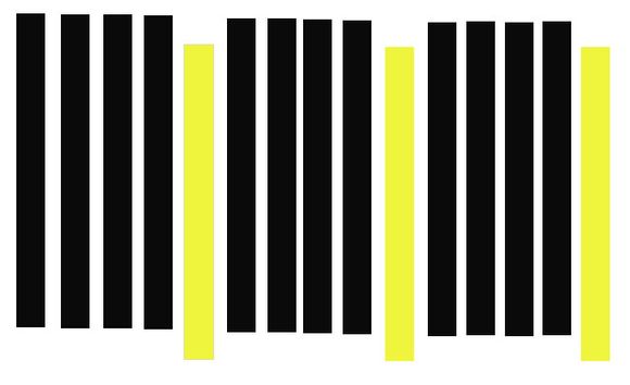
Rhythm—The spaces between elements can create a pattern or a rhythm between elements. The repeated patterns create a visual tempo when used in varying sizes and patterns. They may seem to create a flow or movement.
Movement—To create the illusion of movement in all or part of a work or the path that your eye takes across the picture plane. See how the elements move your eye throughout the composition?

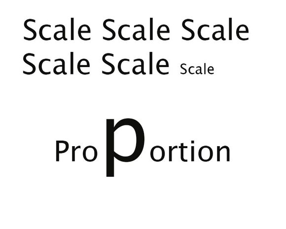
Proportion/Scale—Scale is how the various elements of the piece work in relationship with each other. Proportion is the relative size of different parts within an object.
Analogy—Proportion could be represented by how big your nose is in comparison to a grouping of people. Scale is represented by how big your nose is compared to the other parts of your face. Here, the proportion of the P is how big it is compared to the rest of the word (whole composition or other elements), while the scale is how big the words are compared to each other.
Balance—There are three types of balance: symmetrical, asymmetrical, and radial.
- Symmetrical—also known as mirror balance. This occurs when objects on either side of the picture plane have equal visual weight.
- 💡Analogy—two kids on a seesaw or teeter-totter need to be the same size/weight to balance and make the seesaw go up and down equally.
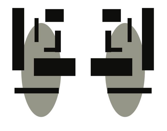
- Asymmetrical—when objects on both sides of the picture plane, while having different sizes or numbers, still create a visual balance.
- 💡Same analogy as above—a bigger kid on the seesaw might need two smaller kids to create (asymmetrical) balance.
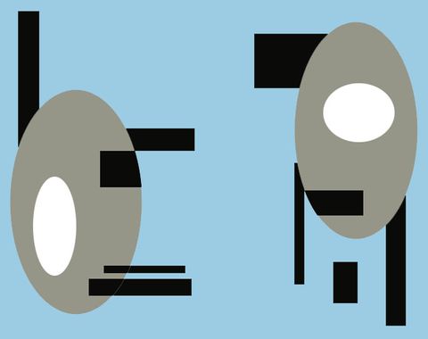
- Radial—when objects create a pattern extending outward (radiate) from a center point either there or implied.
💡Analogy—clocks! 🕔 the hands circle out from the center. The numbers also create radial balance.

Emphasis—When one area of the design is intended to draw the eye to it, placing it in a position of importance.
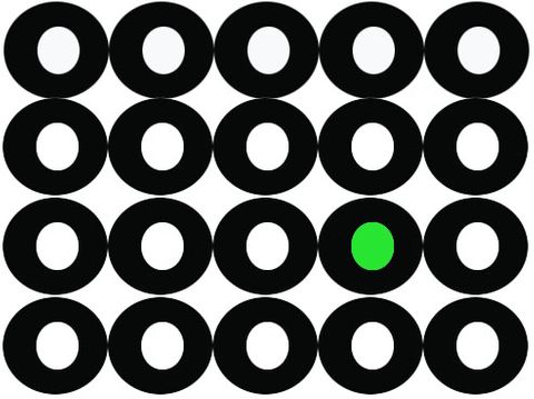
Repetition—When an object or objects are used over and over again in the same manner.
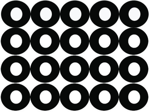
Figure/Ground Relationship—How the foreground and background interact, creating positive and negative space. These may fluctuate in a variety of ways.
- Stable—When there is a clear foreground and background. One is the obvious forefront.

- Reversible—Objects draw attention equally, creating visual tension because either can read as the more important one at any time.
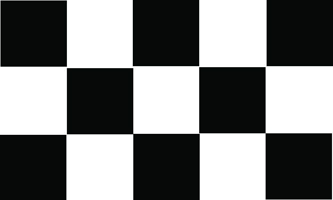
- Ambiguous—Elements can function as both figure and ground at the same time. Both are equally compelling and the viewer is unsure of which is positive or negative space.
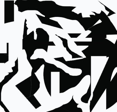
Connection/Juxtaposition—Connection involves placing objects together to show how they are alike and are similar. Juxtaposition involves placing objects together to highlight their differences.
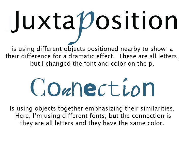
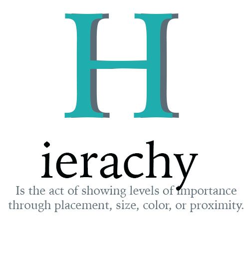
Hierarchy—How visual information is arranged to show importance when conveying information.
When Do I Use the Principles of Design?
Quick answer? ALL THE TIME! These principles of design are used across all art media (materials). When you incorporate the third dimension, additional principles come into play, discussed in another guide. As you can tell, they overlap significantly and can be used in an infinite variety of ways together.
Understanding and using these principles in your work will create new and exciting compositions. Whenever you are sketching out a new project, do some quick thumbnails playing with them and trying different ways to combine them. It's a chance to play and learn when to use them to best achieve what you want in your work. 🙌🏽 😄
Browse Study Guides By Unit
🔖Unit 1: Course Overview
🍥Unit 2: Portfolio Design Skills
🤔Unit 3: Portfolio Analysis
💯Unit 4: Exam Rubrics
💡Unit 5: Frequently Asked Questions about AP Art Portfolios
📚Study Tools
👉Subject Guides

Fiveable
Resources
© 2025 Fiveable Inc. All rights reserved.