1.6 Describing the Distribution of a Quantitative Variable
7 min read•january 13, 2023
Jed Quiaoit
L
Lusine Ghazaryan
AP Statistics 📊
265 resourcesSee Units
Once we finish organizing the set of data of our interest into a certain display of our choice, the next task is to describe the data. In other words we should tell what we see. There are three things that we should look for when trying to find trends and patterns: shape, center and spread. ❗
Shape
To describe the shape of the display, check the following:
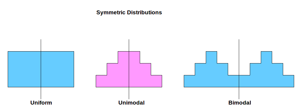
- Symmetry. If you fold the histogram, do you have have equal amounts of data on each side. If yes, then your data are symmetric! Think of the shape of a butterfly and what happens when you "fold" it in half. 🦋
Symmetry in a histogram can occur if the distribution of the data is symmetric around the central value. This means that if you were to fold the histogram in half, the two halves would be approximately mirror images of each other.
A symmetric distribution is one in which the values on either side of the central value (such as the median or mean) are roughly equal. For example, a bell-shaped curve is a symmetric distribution because the values on either side of the peak are roughly equal.
To determine if a histogram is symmetric, you can visually inspect the shape of the histogram and see if it appears to be roughly symmetrical. You can also use statistical measures such as the mean and median to determine if the distribution is symmetric.

Source: Padhai Time
It's worth noting that a histogram does not have to be perfectly symmetrical to be considered symmetric. Some degree of skewness or asymmetry is often present in real-world data, and a histogram may still be considered symmetric if the degree of asymmetry is relatively small.
- Skewness. The shapes can be right-skew and left-skew, the least or highest number in distribution pulls it to its side, and so it makes it look skewed. The skewed distribution will have one tail longer than the other, whereas the symmetric distribution has equal tails. If the tail is longer at the left side, then it is called left skewed, and right skewed for the ones that the tail is longer on the right side. 🦝
Another way to think about skewness is that there are two types of skewness: positive skewness and negative skewness. Positive skewness occurs when the distribution is skewed to the right, with a long tail on the right side and a shorter tail on the left side. This means that the majority of the values in the distribution are clustered on the left side, with a few values on the right side that are much larger or smaller.
On the other hand, negative skewness occurs when the distribution is skewed to the left, with a long tail on the left side and a shorter tail on the right side. This means that the majority of the values in the distribution are clustered on the right side, with a few values on the left side that are much smaller or larger.

Souce: ResearchGate
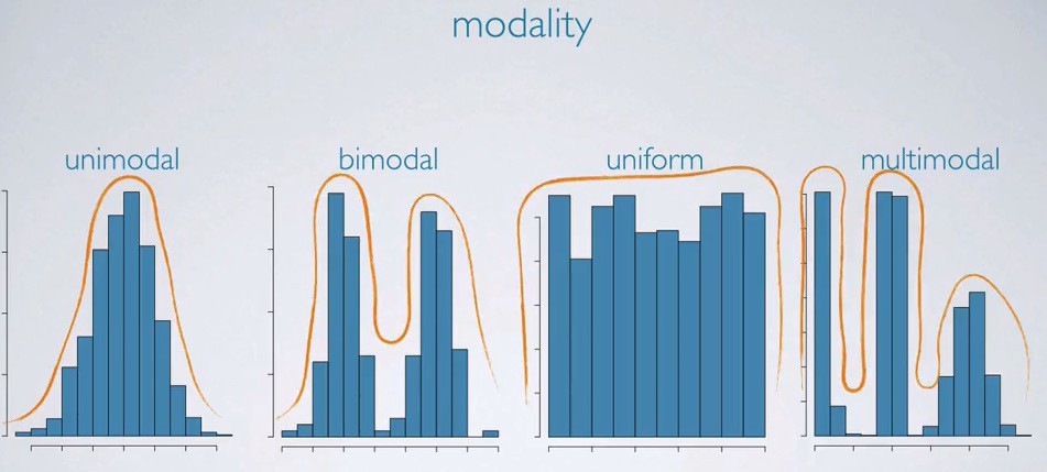
- Peaks (modes). A mode represents the most frequent value or values in a distribution. In a histogram, stemplot, dotplot, or other graphical representation of data (except for boxplots), the mode is often indicated by the peak or peaks in the distribution. ⛰️
A distribution can have one mode, in which case it is called a unimodal distribution, or it can have two or more modes, in which case it is called a multimodal distribution. A bimodal distribution, for example, is a distribution with two modes.
It's worth noting that a distribution can have a mode even if it is not symmetrical or has skewed data. For example, a positively skewed distribution (with a long tail on the right side) can still have a mode if there is a value or values that occur more frequently than any other values in the distribution.
Uniform distributions, on the other hand, do not have a mode because all of the values in the distribution occur with roughly the same frequency. In a uniform distribution, there is no single value that stands out as being more common than any other value.

Source: Towards Data Science
It's important to be aware of the number and location of modes in a distribution because they can provide valuable insights into the underlying data and how it is distributed. For example, the presence of two modes in a distribution may indicate the presence of two distinct groups or subpopulations within the data.
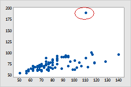
- Outlier. Beware of outliers. Outliers are values in a dataset that are significantly different from the majority of the other values in the dataset. They can be either extremely high or extremely low, and they can have a significant impact on statistical measures such as the mean, median, and range of the data. 🗺️
It's important to be aware of outliers in a dataset because they can skew the results of statistical analyses and cause them to be less representative of the underlying data. For this reason, it is often useful to analyze data both with and without outliers to see how they affect the results.
There are a few different ways to identify outliers in a dataset. One way is to use graphical methods such as boxplots, which can help you visualize the distribution of the data and identify any values that are significantly different from the rest of the data. You can also use statistical measures such as the mean and standard deviation to identify outliers.

Source: Minitab
It's important to remember that outliers are not necessarily bad data, and they should not be automatically excluded from analysis. However, it is important to consider whether the outliers are representative of the underlying data or whether they may be the result of errors or other factors that need to be taken into account when interpreting the results of the analysis.
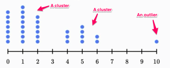
- Gaps. Gaps in data help us detect multiple modes and warn us about different groups of data sources. 🌉

Source: Medium
Center
There are three commonly used measures of the "center" of a distribution: mean, median, and mode. 🎯
- The mean, also known as the average, is calculated by summing all of the values in a dataset and dividing by the number of values. It is often considered the best measure of central tendency for symmetric distributions because it takes into account all of the values in the dataset and reflects the overall trend in the data.
- The median is the middle value in a dataset when the values are ordered from least to greatest. It is often considered a better measure of central tendency for skewed distributions because it is resistant to the influence of outliers (values that are significantly different from the majority of the other values in the dataset).
- The mode is the value that occurs most frequently in a dataset. It is a useful measure of central tendency when there are a few values that occur much more frequently than the others.
In a symmetric distribution, the mean, median, and mode are often close to each other or even equal, depending on the exact shape of the distribution. However, in skewed distributions or datasets with outliers, the mean, median, and mode can be significantly different from each other. It's important to consider which measure of central tendency is most appropriate for a given dataset, taking into account the symmetry or skewness of the data as well as the presence of outliers.
Spread
The center is a good measure, but it's definitely not perfect if we don’t report it with the spread. There are several measures that can be used to describe the spread or dispersion of a dataset, including the range, standard deviation, and interquartile range (IQR). 🕸️
- The range is calculated by subtracting the minimum value in a dataset from the maximum value. While it can be a useful measure in some cases, it has the disadvantage of not taking into account the values of all of the data points, only the maximum and minimum values. As a result, it may not accurately reflect the true variability in the data.
- The standard deviation measures the dispersion of a dataset around the mean. It is calculated by taking the square root of the variance, which is the average of the squared differences between each value in the dataset and the mean. The standard deviation is a useful measure for symmetric distributions because it takes into account all of the values in the dataset and reflects the overall pattern of the data.
- The interquartile range (IQR) is calculated by subtracting the first quartile (Q1) from the third quartile (Q3). The first quartile is the value that divides the bottom 25% of the data from the top 75%, while the third quartile is the value that divides the bottom 75% of the data from the top 25%. The IQR is often used to describe the spread of skewed distributions or datasets with outliers because it is resistant to the influence of these values.
In general, it is a good practice to report both the center and spread of a dataset when describing its statistical properties. In symmetric distributions, it is common to report the mean with the standard deviation, while in skewed distributions, it is common to report the median with the IQR. This allows you to provide a more complete description of the distribution of the data and how it is dispersed around the center.
As we go through the next couple of sections, you'll be more familiar and comfortable describing distributions in terms of shape, center, and spread... woo-hoo! 🤩
Key Vocabulary
- Shape
- Center
- Spread
- Outliers
- Symmetric
- Skewed
Browse Study Guides By Unit
👆Unit 1 – Exploring One-Variable Data
✌️Unit 2 – Exploring Two-Variable Data
🔎Unit 3 – Collecting Data
🎲Unit 4 – Probability, Random Variables, & Probability Distributions
📊Unit 5 – Sampling Distributions
⚖️Unit 6 – Proportions
😼Unit 7 – Means
✳️Unit 8 – Chi-Squares
📈Unit 9 – Slopes
✏️Frequently Asked Questions
✍️Free Response Questions (FRQs)
📆Big Reviews: Finals & Exam Prep

Fiveable
Resources
© 2023 Fiveable Inc. All rights reserved.