1.5 Representing a Quantitative Variable with Graphs
2 min read•june 3, 2020
L
Lusine Ghazaryan
AP Statistics 📊
265 resourcesSee Units
Graphs
This section describes how we organize and display quantitative data. The frequency table is a bit complicated for quantitative data, especially if we deal with vast amounts of data. The good news is that AP doesn’t require you to make one, so we will skip this one. Just know that many computer programs, including our mighty Excel, and your TI series calculator can make it in seconds. The main displays we will discuss are histograms, polygons, ogive, stem-and-leaf plots, and dot-plot.
Histogram, Polygon and Ogive
The histogram displays the data by using vertical bars or bins. The bins are of equal width, and unlike the bar graphs, there is no space between them. If there is a space, then that indicates an actual gap in data with no values. The height of bins represents the frequencies of the classes. Remember, always check the quantitative data assumption to verify the right graph or display.
The frequency polygon displays the distribution of quantitative data by using lines and connecting points at the midpoints of the classes for each bin.
The Ogive uses cumulative frequencies for the classes to display the distribution of quantitative variables. The cumulative frequency adds the frequencies by each class. Ogives help us determine the position of data to see how many values are below or above a certain value.
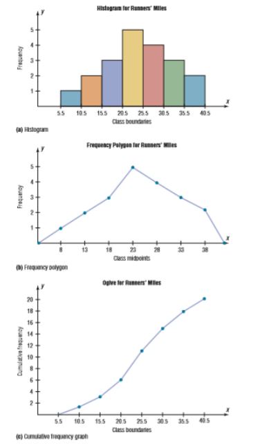
Source: Allan G. Bluman. Elementary Statistics. A Step By Step Approach. McGraw Hill. Eighth Edition. 2009
These graphs are very common in research and in the corporate world.
Stem-and-Leaf Plot (Stemplot)
The Stem-and-leaf plots are similar to histograms, but they reveal the individual values in the display. This is the advantage of stemplots compared with other displays. Since histogram uses grouped data, we miss the individuals in the bins. Like histograms, stemplots can help us analyze data. Whenever you make a stemplot, don’t forget to provide the key to help the reader how to read it.
Dot-Plot
Dot-Plots are more similar to stemplots. Moreover, if you forget how to write the numbers 😉 then this is the best display for you. It is simple, use dots instead of digits to construct it. Dot-plots are the first choice when we deal with a small set of data.
Tips. Turn the stem-and-leaf plot on its side to see any unusual things that data will have for you to be aware of it.
Key Vocabulary
- Histogram
- Relative Frequency Polygon
- Ogive
- Stemplot
- Dotplot
Browse Study Guides By Unit
👆Unit 1 – Exploring One-Variable Data
✌️Unit 2 – Exploring Two-Variable Data
🔎Unit 3 – Collecting Data
🎲Unit 4 – Probability, Random Variables, & Probability Distributions
📊Unit 5 – Sampling Distributions
⚖️Unit 6 – Proportions
😼Unit 7 – Means
✳️Unit 8 – Chi-Squares
📈Unit 9 – Slopes
✏️Frequently Asked Questions
✍️Free Response Questions (FRQs)
📆Big Reviews: Finals & Exam Prep
Fiveable
Resources
© 2023 Fiveable Inc. All rights reserved.